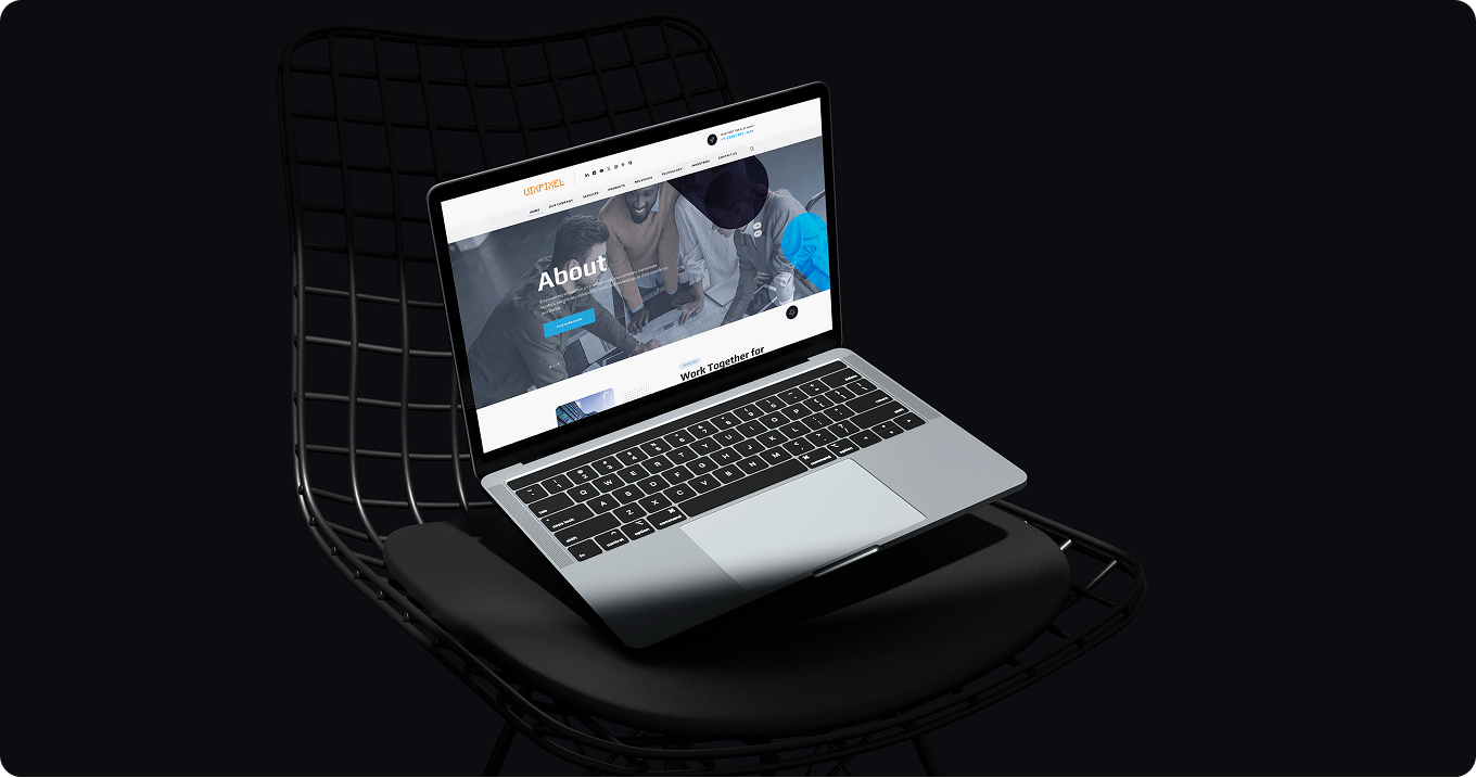







Role - UI/UX & Product Designer

Tools - Figma, Webflow, WordPress, Photoshop, & Illustrator

Websites Designed - 24

WEBSITE DESIGN

All my web design works

How I look at project

A website's purpose changes what it actually needs to be. A booking flow, a company's front door, and a landing page built for a single campaign each ask for something different — a different structure, a different priority, a different way of getting someone from curious to convinced. I don't run every project through the same template. What stays constant is the fundamentals: clear structure, easy navigation, responsive layouts, accessible interactions, and a visual system consistent enough to hold together as a site grows. Everything else — how deep the research goes, how many pages it needs, how much motion it uses — depends on what the specific project is actually trying to do.

Every website has a different audience, purpose, and business goal, so my process adapts to the project rather than forcing it into one fixed sequence every time. What doesn't change is the underlying standard I hold everything to — usability, clarity, responsiveness, accessibility, and visual consistency — applied to whatever the specific project actually calls for.

Function First Paragraph

Before a single color or font gets chosen, I map out who's using the site, what they need to accomplish, and how the content should be organized to get them there.

Built to Perform Paragraph

Once the structure holds up, the rest has to perform — layouts that adapt cleanly across desktop, tablet, and mobile, interactions that stay accessible without a mouse, calls to action placed where someone's actually ready to act on them, and components organized well enough that development doesn't have to guess.

P GD (12)
P GD (12)
P GD (12)

Process

Every project runs through the same fundamentals — research, structure, design, and testing — in whatever order and depth the specific site actually calls for.

Research & Sitemap

Understanding who's using the site, what they need to accomplish, and mapping the pages and navigation before any visual design begins.

User Flow & Wireframe

Planning the path from landing to action and roughing out structure and layout, so the hierarchy is settled before anything gets detailed.

Process

UI Design

Typography, color, spacing, and components built to guide attention and hold together visually as the site grows across more pages.

Developer Handoff

Figma components, specs, and assets organized clearly enough that development can build from them without needing to guess at details.

Prototype & Testing

Walking through the real interactions and checking forms, links, layout consistency, and behavior across devices and screen sizes before anything goes live.

Process b

Responsive

Adapting layouts and interactions across desktop, tablet, and mobile individually, rather than shrinking one fixed version down to fit smaller screens.

UIXPixel UIXPixel UIXPixel UIXPixel UIXPixel UIXPixel


P GD (12)

Every Pixel Earns Its Place.

P GD (12)

What It Takes

Design systems and visual craft. Information architecture and accessibility, carried through from the first flow to the final pixel.

P GD (12)
P GD (12)

What I Consider

These aren't rules I recite on every project, but patterns I keep coming back to because they hold up in practice — small, practical ideas about attention, choice, and perception that quietly shape how a layout, a button, or a piece of content actually gets designed, whether or not anyone using the site ever notices them.

Fitts's Law

Important actions should be easy to reach — sized and placed where a user naturally expects to click.

Hick's Law

Too many choices slow people down, so navigation and menus stay focused rather than listing every option.

Gestalt Principles

Spacing, alignment, and grouping tell users what belongs together before they read a single word — related content sits close together, and unrelated content gets enough room to breathe on its own.

Miller's Law

People can only hold so much at once, so complex information gets broken into smaller, manageable groups instead of one long list or a dense wall of text to work through.

Aesthetic-Usability Effect

A well-designed interface feels easier to use before anyone's actually tested it — visual polish builds trust and patience, which matters most in the first few seconds on a site.

Von Restorff Effect

The one action that matters most on a page — a primary CTA, a key piece of information — gets visually set apart so it doesn't compete with everything else around it.

Proximity & Similarity

Elements placed close together or styled the same way read as related without needing a label to explain it — which is why buttons, cards, and nav items follow consistent patterns.

Few Designs

Not every website I've designed needed a full breakdown of research, structure, and decisions — some are shown here simply because the finished design speaks for itself. This section is a closer look at the visual range across different projects: different industries, different goals, different tones, all held to the same standard of clarity, hierarchy, and consistency. Where the case studies above go deep into process and reasoning, this is the part of the portfolio built for browsing — a way to see the breadth of the work without reading through every decision behind it.

Some of these were full projects from research through to a live site; others were focused visual-design engagements where the structure and content were already set, and the job was making it look and feel right.

That range is the point — being equally comfortable leading a project from a blank page through to launch, or stepping into an already-defined structure and making sure everything about it still feels considered, consistent, and intentional. Take a look through the case studies above for the deeper story, or get in touch if you want to talk through a project.

Case Studys

02 Fekki – AR/VR Object Visualizer & Assembly App

Designed an AR/VR app that lets users visualize objects and guides them step-by-step through assembly. Kept the interface consistent and visually clean across mobile, web app, and landing page — then converted the Figma designs into a live site in Webflow to ship the marketing site myself.

AR Mobile App Web Design
Design Process
Project 2
03 ChitChat24

Built the interface for a desktop system

Desktop App Mobile App Saas
Explore the Journey
Project 3
04 Guru Gowtham Infotech – IT Rental Management System

Built the interface for a desktop system managing end-to-end PC and laptop rental operations — device tracking, client records, accounting, and quotations in one place. The result: a fully organized system where staff can check device location, pending rentals, and component details in seconds.

Desktop App IT Services
View Solution
Project 4
05 Putu Pets – Pet Caretaking App

A full UX case study built from the ground up — designing a platform where pet owners can find trusted caretakers while traveling, track their pet's emotional state through a smartwatch, and stay connected through a social feed. Covered the complete process: research, personas, user flows, wireframes, and prototyping.

Mobile App UX Research Personal Project
Read Case Study
Project 5
06 all Website Design

Sammer....

Visual Design Web Design 24 Website
Explore Projects
Project 6
07 All Graphic Design - Posters

Sammer.....

Creativity Concept Visual Appearance
Discover the Designs
Project 7